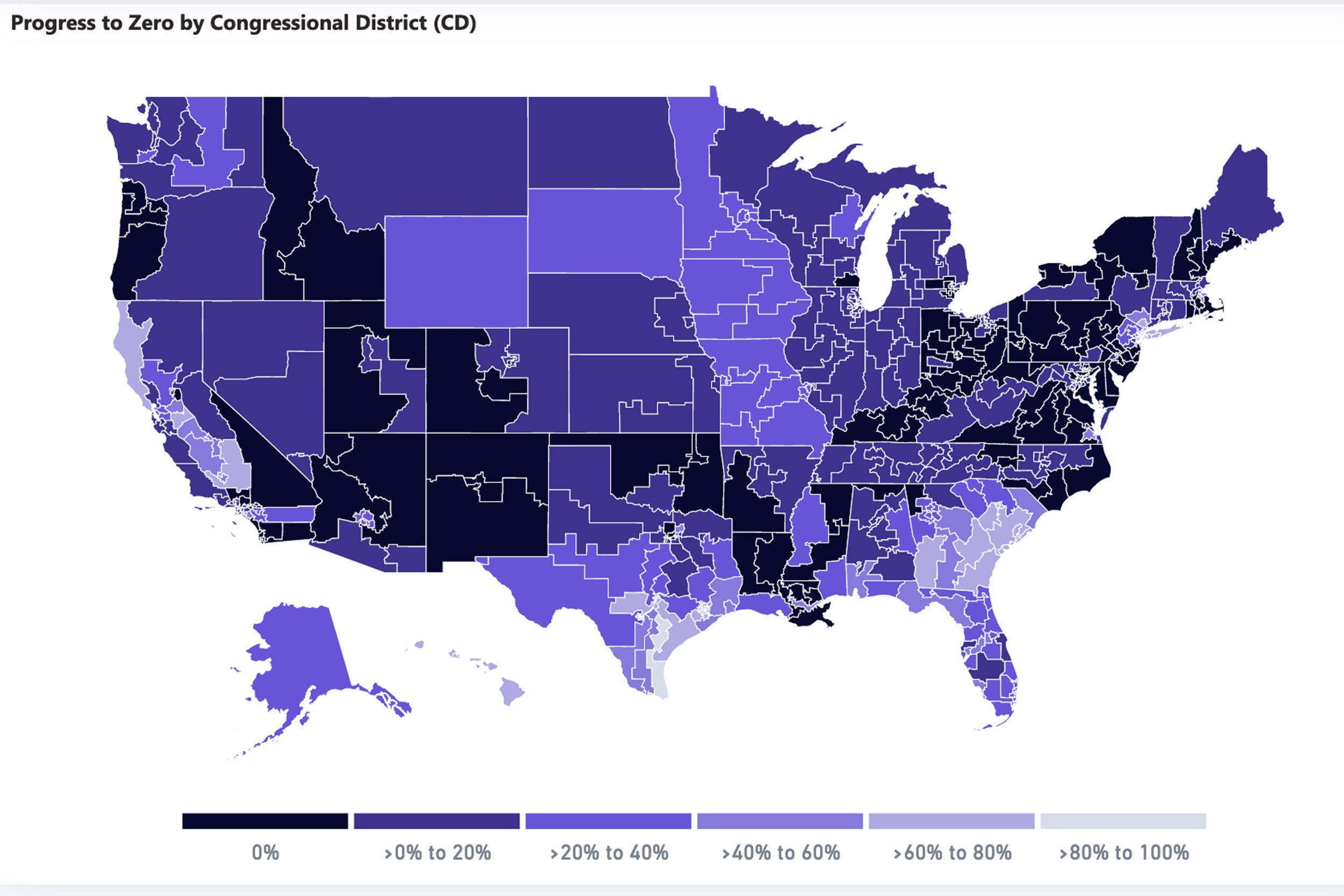
The Microsoft AI for Public Health website features interactive COVID maps based on publicly available data.
Credit: Microsoft AI for Health
Live tracker notes COVID cases, deaths by congressional districts
Harvard centers and Microsoft collaborate on guide for officials and public
More like this
Researchers at the Harvard Center for Population and Development Studies, Harvard Center for Geographic Analysis at the Institute for Quantitative Social Science, and Microsoft AI for Health have created a COVID-19 live tracker that monitors the current status of virus cases and deaths, as well as the reduction of new cases, in U.S. congressional districts.
It is the first compilation of this data, which could be key for elected officials and their constituents to monitor and develop testing strategies, vaccine deployment strategies, and other measures to enable their districts to open safely.
“By connecting previously separate reporting geographies for public health and electoral data, this data set represents an important effort,” said Gary King, director of the Institute for Quantitative Social Science, and Weatherhead University Professor at Harvard.
“As the COVID-19 pandemic continues to spiral out of control in the U.S. (and elsewhere), innovations such as this, which combine both science and public policy, are sorely needed,” said Douglas Richardson, distinguished researcher at Harvard Center for Geographic Analysis.
Nearly a year into the global pandemic, data breakdown by U.S. congressional districts has not been readily available. S.V. Subramanian and researchers in the Geographic Insights Lab, who had previously applied a geographical method to convert county-level opioid prescriptions data to the congressional district level, noticed that similar data was lacking for the pandemic. The team developed COVID-19 metrics for congressional districts and, working with Geographics Analysis center member Wendy Guan, developed a dashboard to share the data. John Kahan, vice president and chief data analytics officer at Microsoft, noted that the team’s work was similar to a project underway at Microsoft, and the groups joined forces to provide mutual scientific support, such as methodologies and data verification.
“The research provides critical insight,” said Nydia M. Velázquez, Congresswoman of New York’s 7th Congressional District and chair of the House Small Business Committee. “Because of this information, the House Small Business Committee can better examine the efficacy of federal programs in reaching the areas most impacted by this virus. Data like this is critical to policymakers, as it improves our ability to legislate changes that ensure aid is going to those that need it most.”
The live tracker contains COVID-19 metrics for each congressional district, such as confirmed cases and deaths per 100K/1M people, cumulative cases and deaths, and new cases and deaths. It also provides the progress-to-zero metric to monitor progress on addressing the pandemic.
The tracker gives elected representatives and their constituents precise information about COVID’s spread in their district. In Texas, for example, a graph reflecting infection by county gives the initial impression that west Texas is doing better than east Texas. When broken down by congressional district, however, the northwestern and southwestern parts of the state actually have the greatest number of COVID cases. The two districts with the most cases “are not even geographically close to the counties with the highest number of cases (Harris County and Dallas County),” said Weixing Zhang of the Harvard Center for Population and Development Studies.
“We’ve heard from many Congressional members that they want to have a better understanding of the disease’s spread in their districts, and so do their constituents,” said Kahan. “The data will be key for policymakers to create policies to ensure safer communities, and allow the public to see the progress we are making together.”


